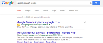
Google has recently rolled out a new and updated design for its search engine, an update (which is an official update now!) that would apply to both organic and paid search results for desktop users. The focus of the new design is on ensuring better simplicity and clarity to the users.
New features of the design are –
- the removal of underlining from the blue headers i.e. title of the website,
- increase in font size for the titles of the website,
- And most importantly the manner in which Google sponsored ads are showcased in the search results.
The biggest change however is in the manner Google’s AdWords are being targeted on search results. Now all ads are preceded by a small yellow box that is labelled as ‘ad’.
This change in design for desktop users however seem to be a part of the broader plan of Google as similar changes were earlier introduced in the search results for mobile and smart phones. By bringing such changes, Google hopes to create a consistent experience for its users across all digital platforms.
